World Press Photo and Walker Evans

The weather was a bit changeable at the beginning of this week, so a perfect opportunity to catch up on my exhibition visits. I visited two as a matter of fact: World Press Photo in Naarden and Decade By Decade about Walker Evans at Huis Marseille in Amsterdam.

wpp 1

A visit to World Press Photo is an annually returning event. You can read my posts on the visits of the previous years. This year was slightly different, though. First of all, 2012 was the year of the Olympics which resulted in a larger than usual number of photos in Sports. Secondly, this year I noticed the large number of photos in the Nature category. I’m not sure if this number was actually higher than in previous years, but it felt that way anyhow.
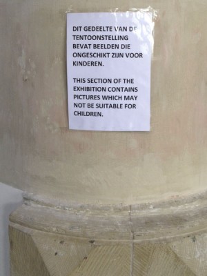
wpp 2Finally, another change to previous years, pictures with shocking and confronting content were exhibited in a separate section of the exhibition. There was an explicit warning that the section might not be suited for children. In previous years this type of pictures was more or less mixed with the other photos being presented. It left many people, including myself, with a slight nausea afterwards. This new approach is much better, for now everyone can decide for himself to enter the section or not and watch the, in many cases, pictures with their horrible content. An improvement in setup, as far as I’m concerned.

Besides the appalling and repulsive pictures of war, crime and violence that continues in many parts of our world (Syria was well represented in this area this year), fortunately there were many pictures to compensate this. As mentioned before, pictures in Sports and Nature, but also in, closer to my heart, Portraits (Staged and Observed). In this latter category I found the 1st prize by Nemanja Pancic most impressive. The way it was exhibited (huge print) and the story behind it, made this for me an exceptional shot.


In contrast with the photo journalism of the world’s reality of today, was the exhibition about the work of Walker Evans. Is it in contrast? I assume that people with an above average interest in photography have come across Walker Evans’ name. There’s plenty of information about his life and work to be found on the internet, but let me add my modest two cents here.
Walker Evans is by many seen as one of the leading figures of 20th-century photographic history. His style is also regarded as having laid the foundation for documentary photography. So look at his work as series of pictures about a certain theme or subject.He is probably most known for his documentation of day-to-day life in a changing America.
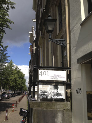
Walker Evans 1The exhibition contains over 200 original photographs providing a retrospective of his entire oeuvre. As mentioned before, documentary photography should be interpreted as series of pictures with a certain cohesian. The exhibition is therefore setup around periods (the “Decades”) in Evans’ life covering a certain theme or subject. So you can see Early Work: New York, Victorian Architecture, Gladiolas, Cuba, et cetera. But he’s widely known for documenting the Great Depression. There’s a separate section called The Depression Years: The South. Evans undertook several trips to the southern states in the ’30s where he documented the architecture of the former mansions (Victorian Architecture). But he also took pictures of simple and poor buildings. Above all, however, he was interested in the people. Using an angle viewfinder, he took a kind of candid, true-to-life portraits. He also used a similar approach in the series called The Subway Portraits (in New York) where people were not aware of being photographed. Although he was contracted by the Farm Security Administration (FSA) to document social and economic living conditions in photographs, he clearly pointed out that his photographs were pure recordings and no political propaganda.  So he recorded the simple homes of craftsmen and miners. “My eye is interested in streets that have just rows of wooden houses in them. I find them and do them. I collect them.”

There was a section dedicated to portraits: The Subway Portraits. A series he made in New York after he completed his work for the FSA. He simply sat opposite the passengers and hid his camera in his coat. Just the lens was popping out and a simple cable release (hidden in his sleeve) enable him to take candid shots. As to why he made these portraits during the subway rides and difficult lighting conditions, he once said: “A rebellion against studio portraiture. I was angry. It was partly angry protest – not social, but aesthetic – against posed portraiture.” I was a bit disppointed, though, that some of his most well-known portraits, eg. Wife of a cotton sharecropper (Allie Mae Burroughs, 1936) was not exhibited. The same applies to Penny Picture Display (Savannah, GA, 1936).

Still, both exhibitions are definitely worth visiting. If you’re in a position to do so, I’d most certainly recommend both. They cover a different time and age, obviously, but the pictures in both exhibitions are just recordings of what’s happening in our day-to-day lives. Whether this is applied to our current time and across the world, or to the first half of the 20th century in America, doesn’t really matter. Not such a contrast, after all.
Walker Evans 2 (2)

Posted in Uncategorized | Leave a comment

Progress

You may have noticed that the blog has been pretty quiet recently. Don’t worry, it’s still alive. Reality is, though, that a number of other issues urgently require my attention at the moment. As a result my photography activities, including updating this blog, have been somewhat slow over the month or so. By no means it’s the end of the line here as far as photography is concerned. I also don’t have the intention to turn it into a blog with a most recent update of a few years ago. Plenty of those to be found on the internet, as it is.

So what’s in the pipeline and what can you expect here? Well, there’s a Walker Evans exhibition going on at the moment in Amsterdam. The plan here, of course, is a visit and small report. There’s also a sportsportrait series in the works. I’m in contact with the local fitness centre to do a series of sportsportraits in August. Hope to come to an agreement on this in the next few weeks. Summer holidays are delaying the process right now.

Anyway, stay tuned for more news on the Walker Evans exhibition and an update on my photoshoot at the fitness centre.

Posted in Uncategorized | Leave a comment

Fotofestival Naarden (Revisited)

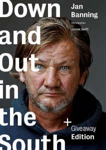
You have to take the title of this post literally: after my first visit to the Fotofestival this year, I went back for 2 more visits, actually. Just to take more time to absorb all the work  being exhibited. But anyway, I was there the 21st when I visited the festival’s bookshop. Besides the overall Fotofestival guide, I also bought 2 books: Joost van den Broek’s Goed Volk (Good People) and Jan Banning’s Down and Out in the South.

Joost van den Broek is a well-known and award winning Dutch photo journalist who works for a number of national newspapers and magazines. Most of his work shows his social engagement and this book, Goed Volk, is no exception. In a non-staged streetphotography style his photos show us how minorities and refugees are dealing with our multi-cultural society. It’s a book about people in our day to day lives and how they always find hope to overcome issues related to integration and (in)tolerance. There’s so much to see on every picture that you can easily spend minutes just watching and analyzing each photo. Because it addresses real issues of human interest and it’s done in an appealing style of photography, I’m very happy I bought this (signed!) book.

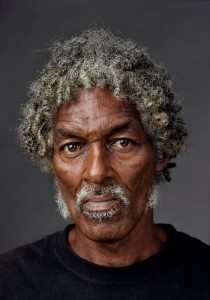
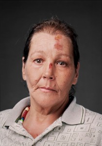
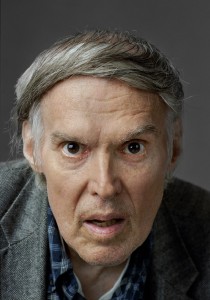
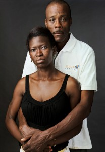
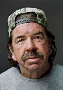
Also dealing with a minority of our society, but in a totally different way of photography, is the other book, Down and Out in the South, by Jan Banning. It’s a series of portraits of homeless men and women in the Southern parts of the US.  What’s so special about the way Jan has pictured these people is, when you see their portraits you’re not able to tell they’re homeless. The photos are not shot in a way you more or less traditionally expect homeless people to be pictured. So you won’t see any empty bottles, cardboard boxes, needles, bridges, et cetera. Don’t expect any stereotypes. No, they look like any other person you know. Like your neighbour, like your colleague, like you and me. They simply happened to run into a piece of bad luck. Could happen to anyone.

Jan Banning - Down and Out in the South Jan Banning - Benjamin Jan Banning - Gloria Jan Banning - Phil Jan Banning - Sharlene and Elliot Jan Banning - Jesse
All pictures were generously provided by Jan Banning.

Much more background information can be found at Jan Banning’s site www.janbanning.com. I especially like to point out that you need to scroll to the bottom of this page. Under Interviews you can hear the talks Jan had with the people before the actual shoot. It gives you the story behind the picture of 11 portraits. Although the interviews are anonomized so you don’t know which story goes with which portrait, it doesn’t really matter. It still tells you so much more and a story can apply to any portrait.

The book has already given me many moments of reflection and inspiration and I’m sure it will continue to do so. I most certainly recommend everybody you get this book, go to the website to get the story behind it and listen to the interviews (radio interviews with Jan himself as well, but only in Dutch, I’m afraid). It’s a fantastic add-on and experience.

Posted in Uncategorized | Leave a comment

Fotofestival Naarden

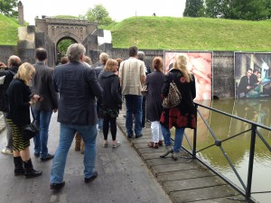
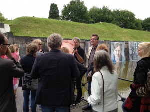
Visited one of our country’s best photo events yesterday: Fotofestival Naarden (FFN – www.fotofestivalnaarden.nl). Naarden is one of our famous small medieval towns where the photo event takes place once every two years. It is spread across multiple locations all over town, so besides some excellent photography, you can also enjoy walking around in a beautiful and historical environment (see www.naarden.nl). One of our national newspapers organized a special, one-time only, guided tour which I joined, of course. The tour guide was one of the festival’s curators, Feiko Koster. He took us to a selected number of locations and shared a lot of information with us about the theme of the event (Don’t Stay Here – Dutch photography on the move) in general and about a number of photographers and their work in particular. As the theme clearly suggests, this time the festival is mainly about what Dutch photographers are doing abroad.

2013-06-12 19.02.29  2013-06-12 19.02.49

Let me briefly mention some of the photographers whose work we saw and talked about: Jan Banning  with his recent series Down and Out in the South. Absolute masterclass! Portraits of homeless people in the South of the US. But not photographed in a way homeless people are traditionally shot. I had already seen a number his photo’s in the different magazines, but when you’re just a few feet away from the large real prints, they really get to you. Bas Losekoot with New York and the Urban Millennium. About isolated people in a crowded city. Olivier van Breugel and Simone Mudde with MC Hotel. People who missed the last bus or subway back home in Tokyo and were forced to spend the night at McDonalds to get some sleep. Wouter Stelwagen with Cityscapes. About what a city of 48 million people looks like in China. Jasper Groen with Portrait for a Breakfast. About very young creative people in cities like  Amsterdam, Berlin, Buenos Aires who want to shape the world in 20 years. Aleksander Willemse with Views. About HDR photography of views of and from rooms in countries like France, Norway, the Netherlands. Resembling paintings almost.

This is just a small summary of what was covered in the tour. The festival itself contains much, much more. Remember that watching the photo’s on the Internet can just wet your appetite at best. You really have to visit the festival yourself to experience what some of the images can do to you. So what you’re waiting for? It closes on the 23rd of June and then you will have to wait until 2015… Hurry!!!

Posted in Uncategorized | 2 Comments

Koos Breukel & Roy Villevoye: Tí Exhibition

For my recent Mentoring Program assignment – do a 5 shot portrait series on location (not in the studio) – I was looking for some inspiration. I decided to pay a visit to FOAM, the Photo Museum of Amsterdam. It currently runs an exhibition called by photographer Koos Breukel and visual artist Roy Villevoye.

Tí is actually the name of a small village in the middle of a tropical rain forest in New Guinea. It’s a community of about 120 people who have been living there completely isolated from the rest of the world for many generations. They’re not familiar with the concept of photography, let alone portrait photography. They’re not used to the thousands of images we’re bombarded with every day in our part of the world. Therefore, they can only look natural when asked to pose. They’re not influenced in any way and also do not pretend to be someone else on the photo than they are in reality. What you see, is what you get. Portrait photography in its purest form. Some people compare these pictures by Koos Breukel and Roy Villevoye with the work of German photographer August Sander. He photographed people in the beginning of the 20th century according to self-invented categories, like women, farmers and artists. The work of both Sander and Breukel/Villevoye show the entire society with all types of people it represents. The mother, the farmer, etc.

The exhibition at FOAM runs until June 19. If you’re in a position to go, I most certainly urge you to do so. As to my personal Mentoring Program assignment I think a more accessible location closer to home is probably better. The photographs and story of Tí definitely gave me plenty of food for thought, though.

Note: this is the place where normally one or more pictures are posted that illustrate the story above. In an attempt to respect photographers copyright laws, I asked Koos Breukel and Roy Villevoye for permission to use their pictures here. However, they were not willing to co-operate because they did not feel affinity with the website and, hence, denied permission to use their work. Kind of childish behaviour, if you ask me, but you can still follow the link to FOAM above if you want see what the pictures look like.

Posted in Uncategorized | Leave a comment

Mentoring program (Update 2)

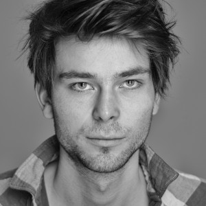
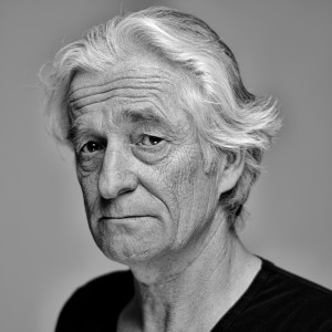
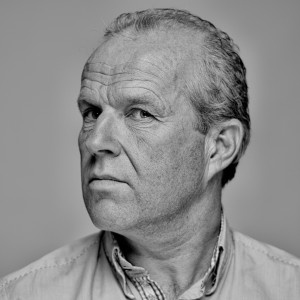
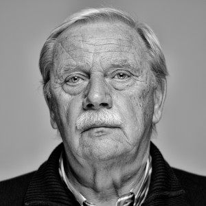
I’ve mentioned my participation in a mentoring program on this blog before (see here). On Monday April 15 I had a next session of this program. I was tasked to continue with my black and white portraits, but to experiment more with the depth of field. I was also asked to use different models. My contribution consisted of the photo’s below.

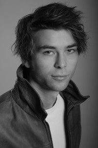
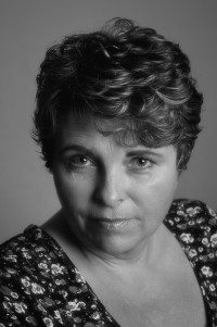
_RCP9436_p _RCP9500_RCP9527 _RCP9512

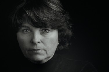
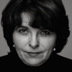
The images above try to say something about the individual’s nature, character or mood, at least that was my intention. I asked them to look ask neutral or serious as possible. Told them not to smile or try to look pleasant. In many cases people attempt to look nice on a picture and automatically give you a smile. In my opinion, a smile is often just a mask behind which they hide. It doesn’t show their true nature or character. I told all of them upfront of what I tried to achieve and what the photo’s should look like. They were, therefore, warned not to  expect glamour shots. For me personally, it was a positive experience that I was able get the end result I had in mind when I started. I read in an article somewhere last week that when people are confronted with their pictures as seen by someone else, e.g. a painting or photo, it can actually affect the person’s self image.

The pictures above can be considered confrontational in several different ways.

  • lighting: one frontal strobe from above and a reflector under the chin
  • camera distance: relatively close with my camera to their face, almost no cropping
  • composition: square pictures with the face in the centre
  • post processing: black and white where wrinkles and skinfolds are accentuated

Click here if you’re interested in lighting setup and other technical details.

What did the mentor, Diana Bokje, have to say about my work? She was excited! On all images the people very much felt at ease and looked straight into the camera. Making contact, touching if you like, the viewer. She liked the the square composition, which contributed to the effect. She also praised the overall tonality, where she said some photo’s almost seem to have a silver glow to them. She was also positive about the use of the limited depth of field, e.g. at the shoulders and ears, while preserving details in the face, e.g. eyes, moustache and beard. In her opinion, these photo’s simply begged to be printed big, e.g. 1×1 mtr (3.3×3.3 ft.). In other words, she thought the photo’s were of a very high level. She’d even like to publish one or two in one of the next editions of her photo magazine.

Assignment for the next session is to take more portraits that are of the same high level and have the same effect, but not taken in the studio, but on location. I can bring my own light or use available light. Whatever, as long as the pictures have the same impact as these have. Challenging…


Posted in Uncategorized | Leave a comment

The Ultimate Workflow Comparison for Nik Software

Yep, its workflow time again. The ideal workflow for image post-processing is a hugely discussed subject on the different photographic forums on the Web. It’s been discussed on this blog several times as well. To put an end to all discussion once and for all, I decided to create a simple overview comparing the different workflow scenario’s. Each scenario describes the necessary steps from image import to final image print result, the impact it has on file management, and the pro’s and con’s of the workflow.

It goes without saying that this comparison is intended for people who do a lot of post-processing (or photo image editing) and are, more or less, struggling with finding the right set of tools and proper workflow. Five possible workflow scenario’s are being compared. Lightroom (LR4), Photoshop (PS), Capture NX2 (CNX2) and Nik Software Color Efex Pro 4 (CEP4) are being used in various combinations. The scenario’s are:

  1. Lightroom 4 + Color Efex Pro 4
  2. Photoshop + Color Efex Pro 4 (with and without Smart Objects)
  3. Lightroom 4 + Photoshop + Color Efex Pro 4
  4. Capture NX 2 + Color Efex Pro 3
  5. Capture NX 2 + Color Efex Pro 4

What are the steps you have to take to import and modify an image? What is the impact on the image file(s)? What are the pro’s and con’s? Scenario’s 4 and 5 are only applicable if you’re using Nikon RAW images (.NEF). In the comparion CEP4 is being used as an example of a Nik Software product, but it can be substituted for any other product from Nik Software.

You can find the Ultimate Workflow Comparison here. Enjoy!

Posted in Uncategorized | Leave a comment

Mentoring program (Update 1)

Back in October last year I posted an entry on this blog that I was about to participate in a Mentoring Program – organized by my camera club – and that I would keep you posted on the developments. I have done a pretty poor job of this, so far. Here’s a first entry to make it up a little and make everybody who’s interested aware of the progress I’m making.

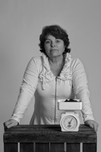
It’s a group of 10 people, evenly split across 5 women and 5 men. Mentor is Diana Bokje, editor in chief of the Dutch national photo magazine Fotografie. For the first session (back in October 2012) I had to bring 3 pictures illustrating my favourite topic (or theme). I randomly picked the following 3 studio portraits.

_RCP7977_w_bw  _RCP7816_w_bw  _RCP8818_w

In my case, Diana’s feedback concentrated on the second of the above portraits. She thought that technically it was a good picture, but the camera position was a bit too high which made the model to look up to the photographer. She felt itwas an undesired, i.e. not intended, side-effect of the camera position, in this case.
All students received an assignment for the next session. Everybody also received names of other photographers whose work could be used as a source of inspiration for the various topics. I was given the names of Stephan VanfleterenArmando Jongejan and Hanneke van Leeuwen. My assignment for the next session was to do a series of live pictures. Diana  would like to know the model a bit better (through the photo’s, that is).
Unfortunately I couldn’t attend the 2nd session, but I did send in the photo’s below.

_RCP9047_w  _RCP9111_w

_RCP9063_ShiftN

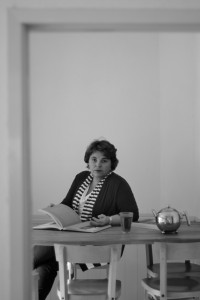
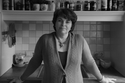
The above photo’s were taken not long after I visited Arnold Newman’s Masterclass exhibition. So, with all due respect, they were slightly inspired by Newman’s work. Diana’s feedback was that I succeeded in giving her an idea about the type of woman the model is.
For the 3rd session the assignment was to bring pictures that would reveal more of the model’s character and not to use any attributes. I found this extremely difficult to accomplish. Out of the work of the 3 photographes I was given, Stephan Vanfeleteren appealed to me most. So black and white photography to begin with. Relatively harsh lighting with deep blacks to create a dramatic feeling. Here’s what I did.

_RCP9291_w  _RCP9380_w_cep

Diana’s feedback was very positive, especially about the second picture. Good balance with the black sweater and the overall dramatic effect. But still showing a friendly character!
Assignment for the 4th session, in April, is to continue with the black and white portraits as in the second photo above, but to use different models this time. Also experiment with a smaller depth of field. Sounds I’ve got work to do. Stay tuned for another update on the Mentoring Program.

Posted in Uncategorized | Leave a comment

Workflow with Nik Software products

About time I share with you my thoughts on photo-editing workflows. No images this time and only intended for techies who are into this stuff. Frequent visitors of this blog know I do my post-processing with Capture NX2 (CNX2) and Nik Software’s Color Efex Pro 3 (CEP3). I still believe that in many ways this is a very strong combination with some clear advantages. But I’m not very religious about this topic, contrary to many others from what I read on various sites and forums. Working with CNX2/CEP3 has its pro’s and con’s. Working with Adobe Lightroom and Photoshop has its pro’s and con’s also. There is no good or bad. It comes down to what suits you best.

One of the big pro’s of CNX2 is its non-destructive nature. This means I can make changes to an image and save it without losing the original image settings. The modifications will be stored in the same NEF file under a name I can specify. I can have a series of different sets of changes (including those from CEP3!!!), each under their own name and all stored in 1 single NEF file. The original settings remain in there as well. All in 1 single file. When I want to redo some of the modifications, I simply re-open the NEF image and all my changes are still in there, so I can change whatever I like again. That’s what I call non-destructive! This is not to say that Abobe products are no good, I simply tell you what I like about CNX2/CEP3.

But the story doesn’t end here. Since I seem to be doing more and more work in black and white, I’d like to work with Silver Efex Pro 2 (SEP2) as well. And here’s where it all starts to slide a little bit. To begin with: SEP2 is not as integrated with CNX2 as CEP3 is. The big advantage of having all changes, including those from CEP3, in 1 single NEF file does not apply to SEP2, I’m afraid. Sure, you can specify in CNX2 you want to use SEP2 as an external editor, but when you save your changes in SEP2 it can only write it to a TIFF file (no NEF support) and your actual changes are lost. Meaning a next time you have to start from scratch if you want to redo your changes.

Well okay, not being thrilled by the CNX2/SEP2 (lack of) integration, I gave Lightroom 4 (LR4) a try with SEP2. Being able to organize and manage your entire photo-library in a catalog is like heaven. With CNX2 you’re on your own, since it completely lacks this functionality. Just as in CNX2, you can specify an external editor in LR4. Multiple even! But LR4’s way of working with SEP2 is the same as in CNX2, I’m afraid. Destructive. Image changes in SEP2 are lost once saved.

The only way, at the moment so it seems, is to include Photoshop (PS) in the workflow as well. I can open a NEF image in PS and then use SEP2 from here (menu Filter/Nik Software/Silver Efex Pro 2) and do the black and white magic in SEP2. Click on Save in SEP2 when done. It will bring you back to PS, but the big difference is your changes are stored as a Smart Object layer in PS. Here you can save it as JPG, but you will lose your layer and, therefore, your changes. Instead save it as a TIFF. Yes, it will definitely be big! Over 100MB easily.

So, for my black and white photo-editing it seems PS/SEP2 is the only viable solution from now on that allows me to work in a non-destructive way. There’s no way escaping TIFF too, so it seems. I’d better start ordering some extra storage capacity. And I still have the option of doing my basic photo-editing (exposure adjustments, crop, straighten, contrast/brightness corrections, etc.) in CNX2 or LR4. With CNX2 I can use the saved NEF file to be processed in PS/SEP2. With LR4 I can invoke PS by using menupath Photo/Edit In/Open as Smart Object in Photoshop.

The dream of a one-size-fits-all photo-editing tool will always remain a dream. It will never come true. Nikon, not especially known for its software skills and vision, is not very likely to develop CNX2 any further. Google, now the proud owner of Nik Software,  doesn’t have a clue what to do with professional photo-editing software. What would be ideal would be to have a sort of shell around the various Nik Software plugins. More or less the way CNX2 and CEP3 work together. But both are at the end of their lives. So a new CNX2, by whatever vendor and under whatever name, but with a new fresh look and feel and supporting all Nik Software plugins. I honestly don’t think, however, Google is going to be this vendor. Perhaps they can keep Snapseed and sell the rest to a party that understands this market. Who knows. In the meantime it feels like being stuck between rock and a hard place.

Posted in Uncategorized | 3 Comments

More free press

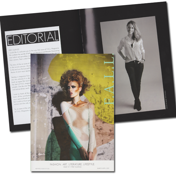
Earlier this week I wrote about the publicity around a new magazine called F.A.L.L. which stands for Fashion, Art, Literature, Lifestyle (www.fallmagazine.com). Well, they got their PR-engine running at max speed this week. Milou Verbeke, editor in chief, gave several interviews on national radio and a number of national newspapers wrote about the magazine as well. Yesterday the first issue was presented during the official launched in Amsterdam with a big party.

It has an editorial written by Milou and the photo that I toook of her a few weeks ago. With my name being mentioned this time! I think it’s very brave to start a new magazine business these days. Perhaps too much common sense prevents people from starting a new business. Perhaps it takes more guts than sense. Time will tell, but in the meantime I wish her and her colleagues all the success in the world.

Posted in Uncategorized | Leave a comment