Free press

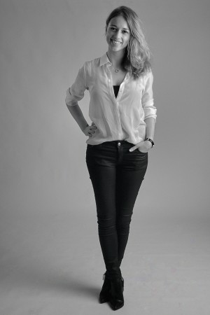
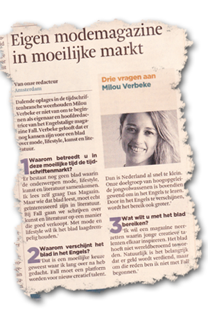
Remember that not that long ago I wrote one of my photographs was published in Playboy magazine? Well, if you don’t, then have a look here. But anyway, every photographer likes to see his work published. No matter how small – in terms of actual print or circulation of the media – as long as it’s printed with your name. My eldest son’s girlfriend, Milou, is starting her own lifestyle and fashion business called F.A.L.L., along with a website and magazine. Have a look here to see what it’s all about. I did a fotoshoot with her a few weeks ago, to get a picture to go with an editorial piece in her magazine. In one of our national newspapers today was a small article about her starting her own business in a difficult market. Along with a picture of her. See the article and the original picture below.

It remains amazing to see how these photo editors ruin the original shot. And what’s even worse: no mention of the photographer whatsoever! My name was photoshopped in the original, but as a result of the heavy cutting completely left out.

Well, never mind. I’m glad I was able to help her with the photoshoot. Good to see the material is being used. There will be 2 more articles about her business in 2 other national newspapers later this week. One with and one without a picture. And her own magazine will officially be launched in Amsterdam on the 20th. I’ll be there as well, just to make sure they’ve used the proper image and with my name attached.

Posted in Uncategorized | Leave a comment

Gregory Crewdson

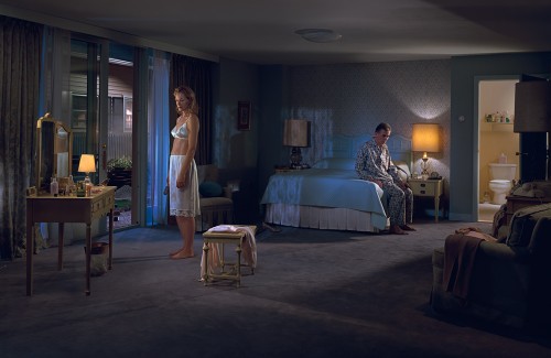
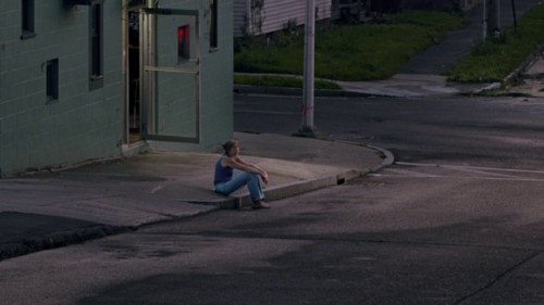
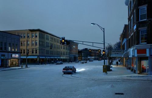
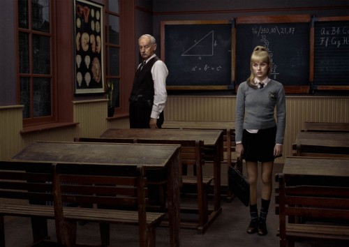
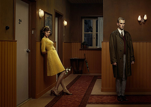
The previous entry was dedicated to Erwin Olaf and also some of the painters that influenced his photography. A few weeks ago there was a documentary on television about photographer Gregory Crewdson. To be honest, a name I’d never heard of until then. I watched it with great interest, though. And noticed the similarity with Erwin Olaf’s work. Also their way of working and eye for the smallest detail is very much the same. Not long after I visited the exhibition, I read an interview with Erwin Olaf. Guess what, when he was asked to select 10 photos from 10 photographers he admires, Gregory Crewdson was one of them. Have a look at some of Crewdson’s photographs.

There’s a film called Brief Encounters about Gregory Crewdson and the way he works. Please visit www.gregorycrewdsonmovie.com. As far as I can see on this site it’s only shown in the US, so the rest of the world has to wait a while. But if you’re in a position to watch it, I certainly advise you to do so. If you’re not, there’s also some material to be found on YouTube. Have a look here.

Posted in Uncategorized | 2 Comments

Berlin

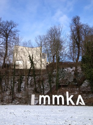
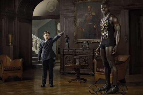
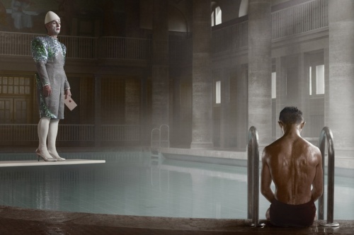
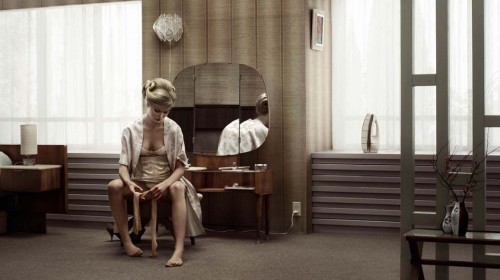
No, this is not about the German city, as you probably would have expected. This is about the new series from Erwin Olaf. I recently visited the Museum of Modern Art in Arnhem (MMKA). As a matter of fact, the exhibition is called Regressive and consists of the series Dawn & Dusk (2009), Keyhole (2011) and Berlin (2012). The last two series were exhibited for the first time in the Netherlands.

Erwin Olaf’s work is best described as magic realism. His images are of realistic and recognizable environments, but contain elements that are not expected to be there. This raises many why questions for the viewer and makes you stand still by many of his photographs. All his photos are heavily directed and staged.

There’s plenty of information on Erwin Olaf to be found on the internet. So I’m not going to repeat here what you can find yourself and pretend I’m some sort of guru. A good place to start is www.erwinolaf.com. Out of the 3 series that were exhibited I liked Berlin best. Mainly because it reminded me of his other work in Grief (2007), Hope (2005) and Rain (2004).

Erwin Olaf is clearly a perfectionist. Every photograph is carefully directed to the smallest detail. But also the clothing, the lighting, the background, everything. Berlin was shot, as the name suggests, in Berlin in 2012. The 1920’s and 1930’s inspired him for this series. He sees a certain resemblance with the world we live in today. Somehow we feel something is going to happen, but in the meantime we continue with dancing and singing. The city had its cultural hayday in those years just as it’s having today.

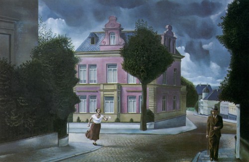
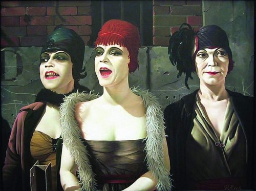
Another area of the museum was dedicated to various magic realistic Dutch painters like Carel Willink, Pyke Koch, Dick Ket and others. You’re immediately struck by the resemblance with Erwin Olaf’s photography. In several interviews Olaf indeed states that he has been influenced by the painters from this art movement. If you’re not familiar with these painters, do a bit a browsing on the internet. To give you an impression of their work, have a look at some of their paintings below. Notice the striking similarity.


Posted in Uncategorized | Leave a comment

Inverse Square Law

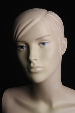
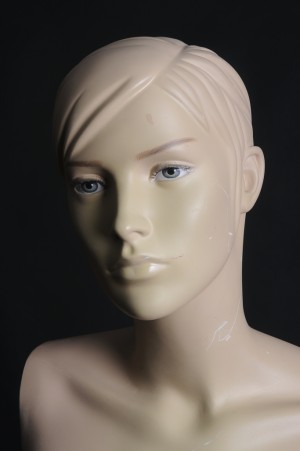
And so the experimenting with the various lighting setups continues. Probably trillions of explanations and examples of the inverse square law can be found on the Web, but nevertheless I just wanted to add my own version. For no reason in particular, other than to be used as an excuse to play with my new girlfriend.

So what is this inverse square law all about? Well, in plain words it states that the longer the distance between model and light source is, the longer the light will travel behind the model. Kind of weird, when you think about it, because it means that the closer you bring the strobe to the model – and thus the closer you bring it to the background – the lesser it illuminates the background! So let’s see if we can prove this.

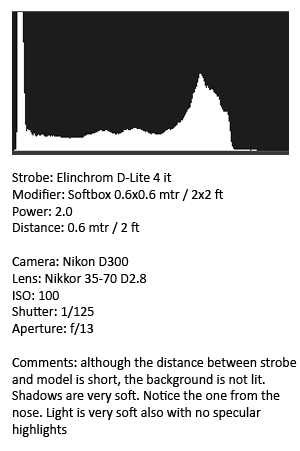
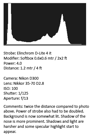
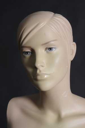
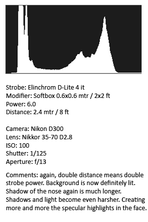
Here’s what I did. I made 3 marks on the studio floor. One at 0.6 mtr/2 ft from the model, then one at 1.2 mtr/4 ft, and then te last one at 2.4 mtr/8 ft. So doubling the distance between model and strobe each time. Here are the results with my comments on the right.

This little experiment tells us a number of things:
1. The bigger the distance between model end light source, the more the background is lit. The shorter the distance, the darker the background.
2. The bigger the distance, the longer and harsher become the shadows. The opposite is true if you make the distance shorter.
3. The bigger the distance, the more specular highlights you will see.

There is no right or wrong with this, though. As stated many times on this blog before, the distance you use in your portraits depends on what you want the image to articulate.

Posted in Uncategorized | Leave a comment

New girlfriend

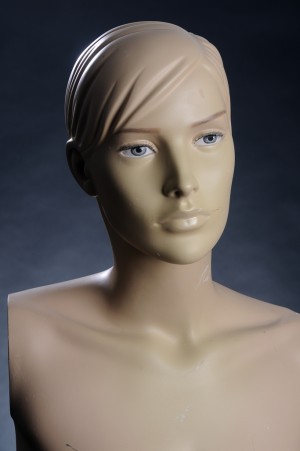
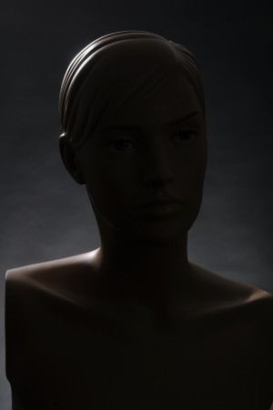
To start with, I’d like you to meet my new girlfriend. You can see her on the photos below. Isn’t she adorable? Always willing to pose, never complains, very patient. Simply put, every photographer’s dream! Came across this shop on the web the other day. Turns out they’re located only a couple of villages from where I live. Literally tens of thousands of new and second-hand mannequins in all sorts and flavours. I couldn’t believe my eyes. So one of my wishes for 2013 (see last blog entry from 2012) is already fulfilled. Now I can play with lighting setups as much as I like without bothering one of my family members anylonger.

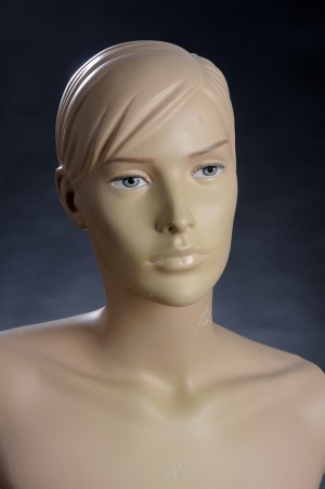
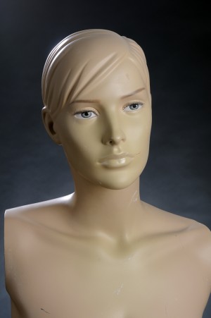
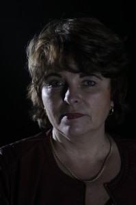
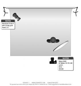
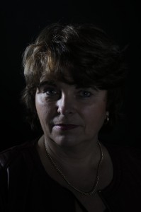
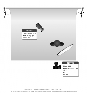
To illustrate this, here are some shots I took today. They’re all taken with the lighting setup I described on January 1. See the diagram over there if you want. The first portrait is taken with the regular 20° grid hairlight. The portrait next to it uses a 30° grid. Always wanted to test the difference, but found it too much hassle with an (impatient) live model. The shot taken with the 30° grid hairlight shows a bit more light on  the model’s right shoulder. What bothering me, though, is the light entering the lens when you look at the photo’s top lefthand corner (remember my studio is only 7ft/2.10 metres high) So I’ll most certainly stick with the 20° grid from now on. The 3rd portrait illustrates the effect of the removal of the reflector (on the right of the model). Finally, the 4th portrait is without the mainlight and showing the effect of the hairlight (and backgroundlight).

I’m sure you’ll be seeing more of my new girlfriend in future entries on studio lighting setups. It also allows you to prepare your lighting setup for shoots with live models so you don’t have to bother them with testing and other preparations. You can fully concentrate on the pose, composition and what you want your portrait to articulate. I most definitely recommend such a mannequin stand-in model if you’re serious about studio lighting.

Posted in Uncategorized | Leave a comment

Lighting Setups Part 2

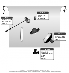
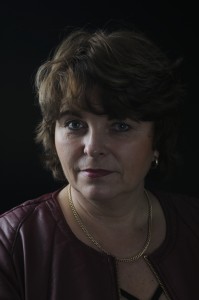
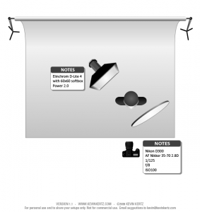
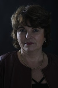
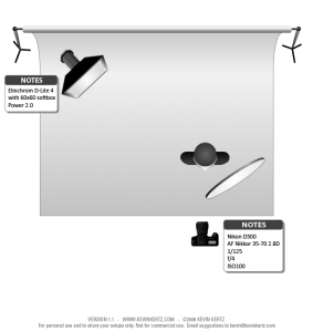
Continuing with yesterday’s topic, here’s another example of a studio lighting setup. In fact, it is my standard setup for regular straightforward headshots. Noting fancy, but technically perfect lit images. If someone would call me in the middle of the night and ask me to do a photoshoot, this would be the setup I would use. I can set it up with my eyes closed.

It uses 3 strobes: 1 mainlight, 1 hairlight and 1 background light. For the first 2 I use my Elinchrome D-Lite 4’s. For the background light I use my Nikon SB900 flash unit. But equipped with a Skyport receiver, so it is triggered by the camera at the same time as the other two. For the hairlight I didn’t use a boom, but it more or less illustrates that the strobe is a bit higher than the softbox. As a matter of fact, my studio is located in the basement at home. One of the disadvantages is the limited height. For this setup the strobe touches the ceiling (about 2.20 metres/7+ feet). Distance between the model and the mainlight and the hairlight is about 2.5 feet/75 cm. Distance from model to the background is 1.5 metres/5 feet.

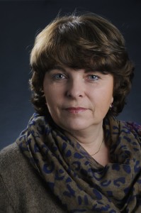
The background light nicely separates the model from the background. I like the little bit of light on the model’s shoulder coming from the hairlight. In general, I think it’s a very good shot from a technical perspective. At the same time, it doesn’t say much about the character of the model. I have quoted Duane Michals on this blog before, but I thinks he’s spot on:
“It takes no great powers or magic to reproduce somebody’s face in a photograph. The magic is in seeing people in new ways.”

So the real challenge is to take a portrait that tells you (as a viewer) something about the person’s character. Have a look inside, if you like. Lighting is an important (if not crucial) element in this. So you do need to understand how it works and the effect it can have on the image. And therefore, on you as viewer.

Posted in Uncategorized | Leave a comment

Lighting setups

In the last blog entry of 2012 I’d like to share some of the results with you of my experimenting with different lighting setups. I had to replace one of my flash tubes the other day and also because I took some days off around Christmas and New Year, I had a good reason and opportunity to spent several hours in my studio.

I used a very simple one lightsource and reflector setup. The images have not been edited or post-processed in any way, so please don’t give this too much attention. This is about the different lighting setups and the effect they have on the ultimate images.
I started with a straightforward setup. One strobe with a 20 degree grid attached. And a reflector. Distance between strobe and model is about 2 metres.

For the second setup I used the same equipment, but moved the strobe much closer to the model. About 1 metre. Brought the aperture down with 1 stop (from f/5.6 to f/8). The shadows become much softer if you bring the stobe closer to the model.

For the third setup I changed the grid to a softbox (without a grid). Distance to the model was about the same as in the previous setup, so about 1 metre. A noticeable much softer light (not surprisingly) overall with much softer shadows. The light seems to wrap itself around the model more or less.

For the fourth and final setup, I used the softbox again, but moved it away from the model. Distance about 2 metres. Opened aperture up by 2 full stops (from f/8 to f/4). Light and shadows a bit harder than the previous setup, but still much softer than setups 1 and 2. Also notice there’s more light on the background (top left corner) than on the previous setup.

Which setup you are going to use, all depends of course, on the message you’re trying to get across with the portrait. Do you want the model to be seen as sweet, gentle, fragile or as tough, hard, strong. Elements such as composition and pose can help you with this, but let’s not forget that lighting is an important (if not the most important) means of communicating a message. The picture that Arnold Newman took of Alfred Krupp comes to mind here, but there are plenty others, of course.

Wishes for 2013? A mannequin to act as a stand-in model….

Posted in Uncategorized | Leave a comment

Directorial photography

This saturday, November 10, the Dutch Photo Association (Fotobond) held their one-day annual event with lectures and workshops on various topics. In the aftrnoon I attended the workshop on Directorial Photography by Jean Marie Piron (www.jeanmariepiron.be) from Belgium.

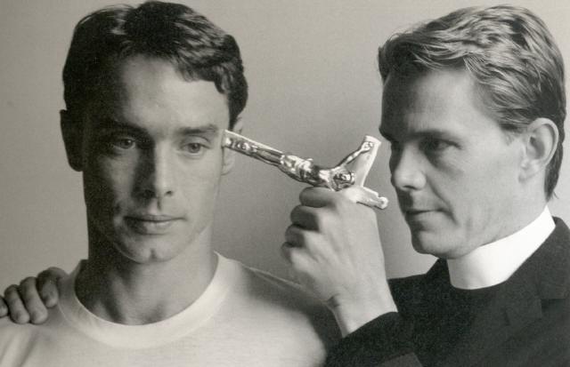
The term Directorial Photography was coined by critic A.D. Coleman, not that long ago, in 1976. What sets photography apart from any other art form is that it is always, in one way or the other, based on something real. A painter can draw a painting of something that only exists in his or her mind. It doesn’t necessarily have to be there in the real world. The same applies to a sculptor. He or she can carve a statue out of stone of something that, again, only lives in his or her head.  And, yes, you can say the same about writing. An author can write a 100% fiction story. Photography, however, must be based on something that is real, that exists. It’s impossible to take a picture of something that doesn’t exist. This is one of the reasons why people, in general, tend to believe that what they see on the picture is real. Directorial Photography refers to a form where pictures are well thought-out, planned, setup, staged, prepared, etc. Manipulated, if you like, but not necessarily with post-processing editing tools like Photoshop – although it can be a part of it. Many times the pictures mislead and fool you: you’re not seeing what you think you are seeing.

During the workshop many Dutch photographers that practice this form of photography were mentioned and examples of their work were shown. For whatever reason, Holland happens to have quite a number of active photographers in this area and most of them with high standards. I might dedicate a separate post on this later. Probably the most famous of them all is Erwin Olaf. You can see his work at www.erwinolaf.com. If you do, have a look at his series Rain, Hope, and Grief (all under Portfolio).

As examples of other – international – big names in the area of Directorial Photography were mentioned: Duane Michals, Cindy Sherman and Jeff Wall. To read more on Cindy Sherman click here to see what I wrote after I visited her exhibition in New York earlier this year. There’s plenty of stuff to be found on internet, but I just want to refer you to a small video clip of Jeff Wall “I begin by not photographing”. To see, click here.

I was impressed by Duane Michal’s series called “Things are queer“. I recommend you do some searching on the internet to see and understand what it’s all about. A famous quote by Duane Michals:

“I think photographs should be provocative and not tell you what you already know. It takes no great powers or magic to reproduce somebody’s face in a photograph. The magic is in seeing people in new ways”
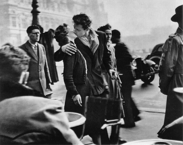
At the end some time was spent on discussing photographs that for a very long time were considered to be real, that is not staged or directed. One example of this is Robert Capa’s famous picture of the soldier who was shot in combat during the Spanish Civil War. By now its publicly known that it’s more than likely this picture was staged, setup. Not real. Another example is Robert Doisneau’s very well-known picture (The Kiss or Le Baiser de l’hôtel de ville) of the kissing couple in front of the town hall in 1950 in Paris. It was originally included in a series on Parisien streetlife Doisneau did for Life Magazine. It was just one of the pictures then. Many years later it was used for calendars, postcards, posters, etc. and became immensly popular worldwide. The kissing woman, a 20 year old actrice called Francoise Delbart, wanted some of the money a lot of people were suddenly making. She started a courtcase, but the claim was rejected. Because of the courtcase, however, Doisneau had to reveal that the photograph was staged and not just a snapshot of the busy streetlife. It was directed! Back in 1950 the woman was given an original print of the picture, with Doisneau’s signature and stamp on it, as a reward for her contribution. She sold it at an auction in 2005 for 155.000 euro.
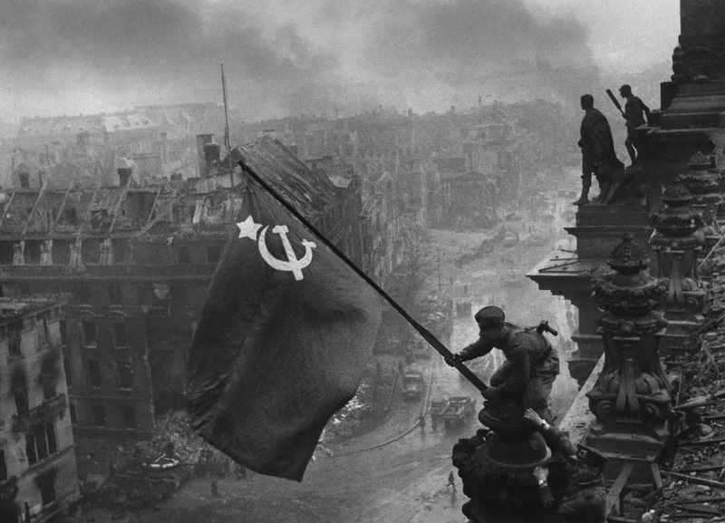
The third and last picture we discussed was about the Soviet flag being raised at the roof of the Reichstag building in Berlin at the end of World War II. A photo by  Red Army photographer Yevgeny Khaldei. The story that goes with this picture is that Stalin apparently wanted a photo of a waving Soviet flag to symbolize his power and strength, similar to the photo of the American flag being planted on the island of Iwo Jima. The Reichstag building was seized on April 30th and a flag was hoisted late that night when it was too dark to take a picture. The next day, the flag was removed by Germans. On May 2nd the Red Army managed to control the entire building. According to Khaldei himself, when he arrived to the Reichstag, he simply asked the soldiers who happened to be passing by to help him with staging of the photoshoot. Two soldiers raised the flag. But that’s not the end. It goes even further. The actual photo was also manipulated afterwards. Censors at TASS, the Soviet press agency, noticed that one of the soldiers was wearing two wristwatches. This could easily be interpreted as an indication of looting by the Soviet soldiers. They asked Khaldei to edit the photograph and remove one of the watches. While he was on it, he also added some smoke to give the picture an even more dramatic effect.
So, in summary, it is fairly easy to understand what is meant by Directorial Photography. All pictures that are planned, though-out, setup, created, manipulated, staged, directed, etc. fall into this category. The work of Erwin Olaf, for instance, is a very good and obvious illustration of what Directorial Photography is all about. Then you have a large middle part of the spectrum where it is less obvious that you’re dealing with staged photographs. And then, at the opposite side of the spectrum, you have the photographs which you didn’t expect to be directed because they look so natural and real. Like snapshots, when you first  see them. But don’t get fooled, though. Also the pictures of Capa, Doisneau and Khaldei are all perfect examples of Directorial Photography.

So remember: you’re not always seeing what you think you’re seeing.
Posted in Uncategorized | Leave a comment

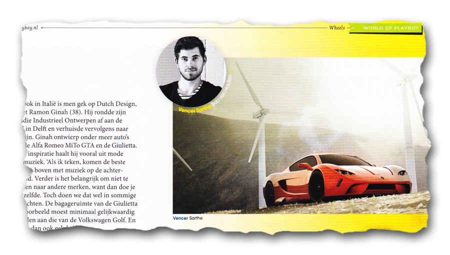
My photo in Playboy

With a title like this I’m bound to increase this website’s hitrate! As is the case in many situations in photography, it’s not always what you think it is. Although I must say that the title is factually correct. But let me explain. First of all, it’s not a photo of me that’s in the December issue of (the Dutch) Playboy, but a photo by me. Secondly, it’s not a nude of a woman, as you might have expected. No, it’s a photo of my eldest son.
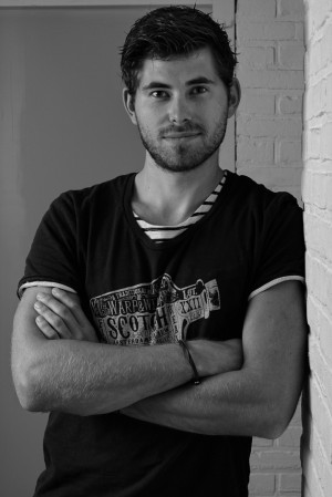
He was approached by Playboy a while ago by one of the editors who he happens to know. They we’re running an article on Dutch car design and how a number of Dutch designers hold high positions with several European car manufacturers. My son is involved in various Dutch sportscar designs, so it made sense to include him in the article as well. A few weeks ago he asked me to take his picture to go with the article. See below.

A decent shot, if I say so myself. More than adequate to go with the article, in my humble opinion. Every magazine has its own photo editors, of course. And this applies to a magazine like Playboy in particular. So, yes, the photo I took did end up in Playboy, no question about that. This is what the end-result looked like.

Some of you might consider this a somewhat disappointing result. From a photographical point of view I agree with this. But an article where my son is being mentioned together with some of today’s hotshots of European car design, makes it all worth it in the end. Even it’s in the Playboy. This being said by an extremely proud father…

Posted in Uncategorized | Leave a comment

Capture NX2 and Windows 8

A short update to let you all know that I upgraded my Windows 7 system yesterday to Windows 8 and Capture NX2 continues to work just fine! I’m using Capture NX2 2.3.0 with Color Efex Pro 3.0 as 64-bit applications. In Windows 8 – of course – they run as a (Windows 7) Desktop application, so not as a real Windows 8 app using the new Metro style, but that really doesn’t bother me. As long as I can continue to use CNX2 in Windows 8.

So, for everybody out there still wondering if CNX2 runs in Windows 8, it does!

Posted in Uncategorized | 3 Comments