Rembrandt lighting

Many of today’s portrait photography books and many of the websites on the same subject discuss the various forms of lighting we can use. One particular form is always described in more detail: Rembrandt lighting. Although enough on this can be found on the Internet already, let my add my fair bit.

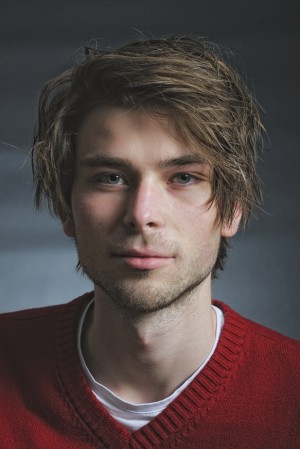
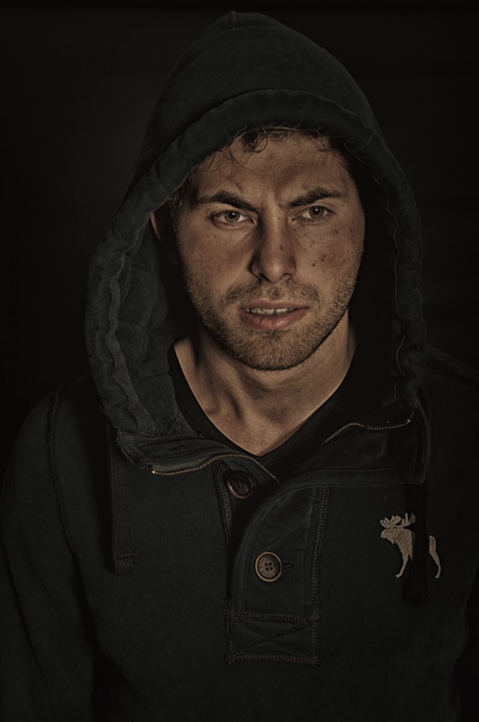
Rembrandt lighting is typically referred to when a head and shoulders portrait is being lit by just one light source from an angle of about 45° to the model. With the light coming from one direction, one side of the face is lit and the other half is a mix of light and shadow. Sometimes a reflection screen is being used to lighten up the shadows. Characteristic for these kind of portraits is a small triangle of light under the eye that is on the shadow side of the face. This is sometimes referred to as the Rembrandt triangle.

Every now and then you’re just lucky. Just as I was this weekend. I was simply taking some shots of one of my sons on a Sunday afternoon. I had no specific Rembrandt lighting in mind, let alone the triangle. But when editing the pictures afterwards on the computer I noticed the triangle under his right eye in the picture on the left .  The picture on the right also shows a triangle, but because of a different pose, less prominent. Normally I wouldn’t have published the photos on this blog, because I don’t think they’re very special, but an exception is justified, I think. Yes, because of the triangle. That’s what make these, in general ordinary shots, a bit more special. For me, anyway.

Posted in Uncategorized | Leave a comment

The portrait factory of the master from Delft

Last Saturday I visited the Portrait Factory of Van Mierevelt exhibition at the Prinsenhof museum in the city of Delft. Although Van Mierevelt (1566-1641) was probably one of the most successful painters of his age, he is relatively unknown today. He mainly did portraits and he soon gained a respectable reputation with his portraits of Dutch Royalties. Soon followed by portraits of Dutch politicians, scientists and poets, which gave him even more fame and wealth.

What struck me was the mercantilism by which he treated portraiture. The factory fashion he used to literally turn out hundreds and hundreds of portraits (hence the title of the exhibition) and the numerous assistants he used. He even used a pricelist where people could order breast pieces (new or copies) or knee pieces (new or copies) in his shop (“winckel”) at standard rates. So, clearly, painting was doing business for Van Mierevelt. A way to make money, and the more, the better. He left 133.000 guilders when he died in 1641. This was a very huge fortune, given an average craftsman earned about 200 to 300 guilders a year. Many people see Henry Ford as the inventor of the assembly line, but with a bit of imiganation (and exaggeration) you might argue if Van Mierevelt beat him to it.

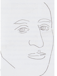
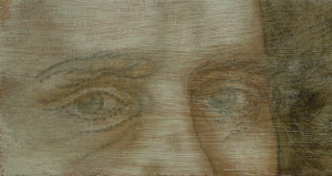
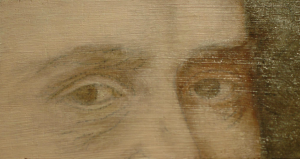
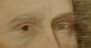
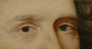
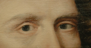
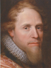
To meet the high demand, Van Mierevelt used a very efficient technique to produce high volumes of portraits. One of the things he used, were templates. He made a template of the main characteristics of a person’s face and used this to make copies and also to make “new” portraits of that same person over time. Below you see part of the portrait of Prince Maurice as painted by Van Mierevelt in 1607 on the left. Next to it you see him as painted in 1625. You would expect Prince Maurice would have posed a second time. Wrong! Van Mierevelt used a template (an imaginary sample is shown on the right) to get the characteristics of his face and just aged it a bit. If you like, a 17th century version of Photoshop!
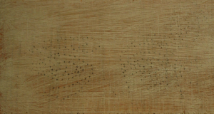
There was a small reconstruction at the exhibition demonstrating how this technique actually worked. Van Mierevelt did all his portraits on wooden panels. After preparing the wood, he presumably used his template, which basically were lines of small holes through which he punched the pigment. This left a series of small dots on the wooden panel. The first image below shows this. Next, he connected the dots showing the contours of the face and gave a sort of sketched drawing. This remained the same throughout the years for one person. From there on he could paint the rest giving it the resemblance it needed without the need for the person to actually pose again.
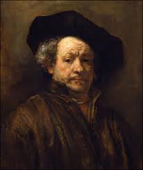
I’m not saying Van Mierevelt was a kind of 17th century Bob Ross. He was a very skilled painter, who just happened to find an immensely efficient way of producing portraits that were in high demand in those days. It made Van Mierevelt a very wealthy man. It’s interesting to see, though, that many centuries later, his name has almost gone forgotten, whilst painters like Rembrandt, who had to struggle to survive during their lives, are now regarded as extra-terestial and whose work is invaluable today.

Of course, the question remains why such a largely popular and successful painter during his lifetime faded into oblivion today. To a large extent, I think, it has to do with his critics. His work was generally characterized as dull and boring. Not in its technique, but in the message it communicated. In the Criticizing Photographs course I’m following right now, there is a phase dedicated to this topic: Interpretation – what does the image tell you; what message did photographer try to communicate. In all honesty, Van Mierevelt’s portraits are not particularly strong in this area. They’re very accurate images of real life people. Nothing more, nothing less. All are more or less in the same pose. All are factual representations of reality. No to little attention has been given to their character, emotion, expression, etc. If you compare this with the work of Rembrandt, Vermeer, Hals and others – not just because of their excellent technique, but also because the strong message they communicate – you can understand why over time these painters are regarded as true Masters and the name of Van Mierevelt is hardly ever mentioned.
Posted in Uncategorized | Leave a comment

Criticizing photographs

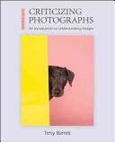
This week I started to attend a new course: how to criticize photographs. It’s a 4 month class with just 1 lesson a month, but with a lot of practice (i.e. homework). The theory is based on Terry Barrett’s book Criticizing Photographs: An Introduction to Understanding  Images.

Our (Dutch) course material distinguishes the following 4 phases on how to interpret a photograph:

  • Description – just tell what you see as objectively as possible
  • Analysis – name the image elements that significant for this photo
  • Interpretation – what is the message of the photo; what is photographer trying to say
  • Scoring – rank it

This was just the first lesson and it only covered the first 2 phases, but it already influences the way you look at images. In the newspaper, in magazines, on the web, everywhere. And actually this is one of the good things. In order to feel really comfortable with it, you have to practice, and practice, and practice. What’s even more important: it also affects the way you take pictures. So, ultimately, it will help you make better photo’s.

At the end of the lesson I had an interesting discussion with one of the fellow students. He stated that on the backside of each printed picture there should be a short summary of EXIF data, i.e. aperture, shutter speed, ISO, focal length, etc. I totally disagree with this (and said so). By analysing the image you should be able to determine all these things. If you see some blurred parts because of movement, you can tell a slow shutter speed was used. It doesn’t matter much if it was 1/8 or 1/15. The same applies to aperture. If you’re able to see the image has a very limited depth of field, you can say it was taken with a large aperture. Again, whether this was f/2.8 or f/1.4 doesn’t really matter. I’m always surprised when people ask for these kind of details, because you can tell (or at least you should be able to).

If I come across other interesting things or discussions in one of the future lessons, I’ll make you aware of it on this blog.

Posted in Uncategorized | Leave a comment

Still life or food photography

One of the things I like being part of a local camera club is that you are more or less forced to think about certain subjects you normally would have ignored or haven’t thought of at all. Our club organises a small internal competition each year around 5 different subjects. One of those for this year is Kitchen, kitchen table, utensils. Each member interprets this subject in his or her own way, of course, and it’s always fun to compare each other’s interpretations afterwards. There are no further rules that apply to the kind of work that is to be submitted, other than that it have to be photographs, of course.

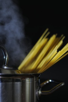
For this particular subject, I started with a kind of strobist approach. I experimented in the kitchen with pots and pans while cooking food. With a piece of black paper as a background and an off-camera flashlight to accentuate the steam. Although, they were OK, I didn’t think they were very strong and convincing.

First strobist experiment

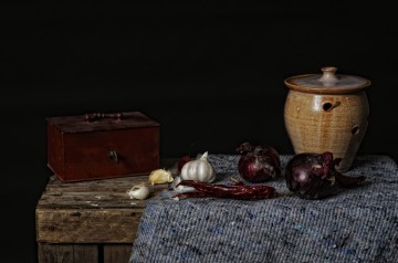
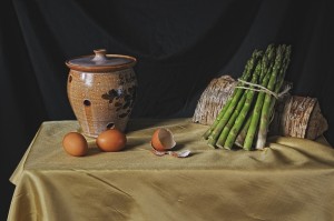
I definitely didn’t want to take the more or less standard food photography shots you see in food magazines everywhere. So, no macro shots, no extreme depth of field. You probably know the kind of shots I’m talking about here. I defined the type of shot I did not want to take fairly well. But what about the pictures I did want to take? I don’t know exactly why, but somehow still life paintings from the 17th century came to mind. One evening I simply played with a composition and lighting in the studio and I must say I was rather surprised with the results.

First still life attempt

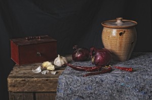
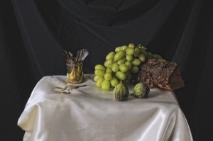
To be honest, I felt quite encouraged with the first attempts. I didn’t like the allblack background, though. I mean, black was OK, but I felt it needed some structure. Anyway, to cut a long story short, the following evenings I continued with my still life food photography in the Dutch Masters style. Here are the results.

As always, I’m more than interested to hear your thoughts. For those considering to take similar photos themselves, I will publish a link here shortly to a description on what I’ve done to get the above results. Enjoy!

Posted in Uncategorized | Leave a comment

Headscarves

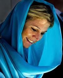
Finally an entry on photography again. The last few weeks, the Dutch national media was all about headscarves. The reason for this hype was the visit of Dutch Queen Beatrix to Oman and the United Arab Emirates. During her visits to some of the mosques over there, she and Princess Maxima wore headscarves. Out of respect for the local tradition. Some people saw this as an approval of the oppression of women in that area. Apart from being beside the point, it is a topic you don’t normally expect to be discussed on a blog like this. Why am I doing it then, you might ask. Well, the photographs taken from the Queen and Princess caused a lot of positive reactions. According to many, headscarves can be very flattering and glamourous.

But it’s not just the Queen’s visit, also World Press Photo has given us some astonishing shots of women with headscarves, as shown here.

Anyway, all of this inspired me to take some headscarf portraits myself. All photo’s were taken with just one single strobe with a simple 60×60 cm. softbox against a black background. And all with a 50mm prime lens set at aperture f/4 at 100 ISO. RAW conversion was done with Capture NX2 and minimal editing with Color Efex Pro 3.

The one below has been edited with Color Efex Pro 3 for a minimal and very subtle Glamour Glow effect. It’s the one that comes closest to what I had in mind and wanted to achieve. A quiet and serious appearance in a serene atmosphere. Feel free to let me know what you think.

Posted in Uncategorized | Leave a comment

Nik Software CEP 3.004 available

Only recently announced by Nik Software and as of yesterday the latest version of Color Efex Pro 3 – 3.004 – is already available for download. This version supports Capture NX2 2.3 in 64-bit mode.

Compliments go to Nik Software for understanding the sentiment in the CNX2 community with the release of version 2.3 and also a very big THANK YOU for making the new CEP 3 plugin available so quickly. Truly outstanding marketing and support. Kudos to Nik Software!

I think with this I’ve spend more than enough on the technical side of photography. Next entries will focus on content.

Posted in Uncategorized | 8 Comments

CEP 3.0 to support Capture NX2 2.3

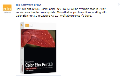
Yes, I know. In the previous entry I promised to spend more entries on photography instead of technology, but I simply have to tell you this. On Facebook today Nik Software published the following statement:

This is simply nothing less than fantastic news! All Capture NX2 users can benefit from 64-bit processing with version 2.3 AND continue to enjoy working with Color Efex Pro 3.0. Of course, there always remains something to wish for, eg. support for CEP 4.0, but nevertheless the announcement is great and I can’t wait….

PS. Thank you Norbert, for bringing this to my attention.

Posted in Uncategorized | Leave a comment

Anniversary

It is one year now that this site has been up and running. The number of visits has been growing steadily month over month and, therefore, this anniversary calls for a small celebration. Each month I have been publishing entries on the blog about things that have one thing in common: photography. This ranges from personal activities to things I’ve noticed in musea or magazines, or to photo editing software. At least, things that I found worth sharing with the rest of the photographic community. I realized that lately I have covered the software element – in particular the editing piece – quite extensively. More than likely caused by recent announcements of new releases of certain editing products and the lack of integration with other products from different vendors.

Personally, I feel that photo editing is an integral part of photo publishing and therefore I should cover it on my site. However, I also feel – and have stated this several times over the last year – editing should be kept to a minimum. The very basics of photography still remains with watching, thinking and doing. It all starts with a good eye. For detail, for instance. Or for the just the opposite: the overall situation. But you have to have “that eye” for seeing things. Then you have to think of what it actually is that struck you and how you’re going to translate that to the camera. And finally, of course, you have to take the picture. If you all do this as good as you possibly can, then editing should and can be kept to a minimum.

For 2012 my intention – as far as this site is concerned anyway – is to spend more on taking the picture than editing it. Although post-production is inevitable and I’m sure I’ll continue to write about new versions being released by the different software vendors, but I’ll try to avoid it to become too dominant.

I wish everybody all the best for 2012 and may it be the year you will take your best picture ever!

Posted in Uncategorized | Leave a comment

Capture NX2 out, Lightroom in

For those of you who know me better, understand the above title is intended with tongue in cheek. But I was so seriously fed up with the lack of integration between my two favourite editing tools, Capture NX2 (CNX2) and Color Efex Pro 3 (CEP3), that I decided to give Lightroom another chance.

In some of my spare time between Christmas and New Year I downloaded the trial copies of both Lightroom 3 and Color Efex Pro 4 and give it a try. Why not? Lightroom 3 (LR3) is a fine tool with all the functionality a photographer could possibly wish for. If you’re used to another product (CNX2 in my case), you spend a bit of time at the beginning knowing your way around. I guess this is to be expected. However, LR3 was not my main point of interest. I used it as a framework for the CEP4 plugin. I could have used Photoshop Elements instead of LR3 as well. Comparing CEP4 to CEP3 is of a different order, though. So far I have always been very satisfied with CEP3 (and its integration into CNX2). The first thing that struck me was the completely new – and in my opinion much better – user interface. I knew my way around this tool right from the beginning. Then some of the new filters, especially Detail Extraction and Dark Contrast. What a fantastic pieces of equipment. I don’t understand how I have done without these so far! The concept of recipes – basically a defined set of nested filters – is also new in CEP4 and an excellent enhancement. I used the Super Cross Pop recipe as a basis for the photo below and tweaked a bit myself. It consists of the filters Dark Contrast, Cross Processing and Cross Balance. I eliminated Cross Processing, adjusted some of the sliders in Dark Contrast just a bit and added a Vignette filter. Anyway, judge for yourself.

The only problem I have with it is that I want CEP4 now even more than before! Even CNX2 2.3 with a 64-bit version of CEP3 will not work for me anymore. I’m hooked to CEP4, but want it to work with CNX2, CNX3 or whatever (but just not one of the PS products). Even if Nik Software is going to release a 64-bit CEP3 to integrate with CNX 2.3 I will somehow be disappointed. My CEP4 demo version will last for another 7 days. I guess I have to use it as much as I can….

Posted in Uncategorized | Leave a comment

Nik Software’s response

This is the response from Nik Software to the question that I asked them on the lack of Capture NX2 2.3 64-bit support by Color Efex Pro 3.0:

“…At the moment, the development team at Nik Software examines the requirements for a corresponding technical adjustment of Color Efex Pro 3.0 Complete with the highest priority…”

So it seems they’re investigating the possiblity of CNX2 64-bit support. No commitment that they’re going to deliver, but at least it’s a positive statement for all CNX2 2.3 users out there. Now let’s wait and see…

Posted in Uncategorized | 1 Comment