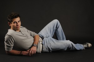
Time for a commercial break. Well, sort of. My eldest son, Bob, finished the design of his own personal website yesterday and asked me to take some pictures of him that he can add. He’s currently at the final stages of his study Product Design and Engineering and hopes to graduate later this year. He created his website to promote his design business. I certainly recommend you all to have a look at www.bobvanhouten.nl and be impressed with his amazing work. My pictures of him only form a small contribution to the site.
 One of the pictures is to be shown across the full width of the site. We decided, for this purpose, it would be best to take a picture of him lying on the floor and use a landscape format. He will probably modify it with Photoshop to adjust it to meet the needs of the website’s design.
 The other picture is in standard portrait format. To be used at the Contact page of the site. Instead of having him on the floor, I put him on a stool this time (and had him slightly looking up to me).
I’m quite satisfied with both results and I think they fit the bill. Bob’s happy with the images as well. Soon on display at his site.
Again, a visit is highly recommended. Stay tuned!